Retooling for a Mobile-first Apollo Education Group 2013 CSR Report
⚠️ This was originally posted on July 23, 2014. The information may be outdated!
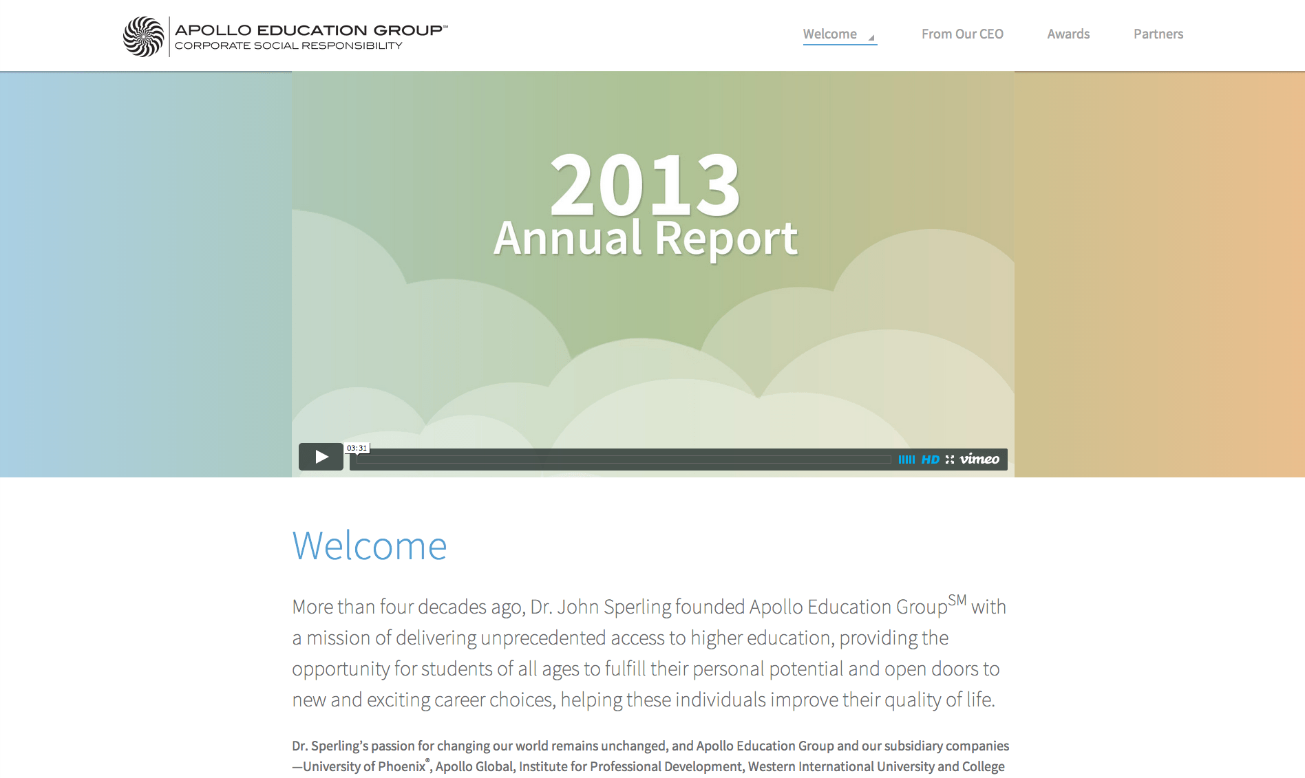
My employer, Apollo Education Group, published our 2013 Corporate Social Responsibility Annual Report in February of this year. The project, like our 2012 report, was a fantastic team effort and fun project for me personally. From a web development perspective, my team added a lot of tools and techniques to our repertoire during this project, and we are very proud of the results.
Making the Decision to Build Mobile-first
Mobile-first responsive design is a no-brainer for many web projects these days, but my experience is that it’s still not a common approach in a corporate environment. I think there’s a perception that it requires more work (debatable), or that it’s not needed (I think there’s some “chicken or the egg” at play when mobile stats are low, which makes justification for a responsive site more difficult). Ultimately the decision fell upon me, and I opted to create a mobile-first responsive site for the following reasons:
- Our content was not specifically written with an eye toward mobile, but the page content is fairly light anyway and worked well in a mobile context.
- It’s easier for me to build a page out than shrink a page down; it just makes more sense to me.
- It provides more opportunities to optimize by loading small image assets for mobile and large image assets for desktop.
- This design, unlike last year’s, will stick around for several years at least. We wanted it to be as future-proof as possible.
- It feels right.
- Jerk web developers would troll if it wasn’t. 😉
We wanted to make this website fast and light, and I think we succeeded. The home page weighs in a 707KB when signed out of the WordPress.com network in a modern browser with gzip. Most other pages on the site are around 500KB. If you’re signed in to WordPress.com, a lot of other resources are downloaded for the WordPress.com admin bar, but chances are they’re already cached in your browser.
As for designing the responsive layout, our graphic designer is very experienced in designing for the web, and although he doesn’t know HTML or CSS, he understands the general concepts. My team’s job is made easier by working with a designer who has enough technical savvy to make designs that don’t elicit a groan from front-end developers. During the design process he mocked up both desktop and mobile versions of the site. The desktop versions were helpful for the stakeholders and our copywriter to make revisions and edits to the design and the content throughout the project. Both versions were helpful to my team as we started laying out the site at various breakpoints. We were able to collaborate on the design and make adjustments that made things easier to develop, yet remained true to the spirit of the original design.
Ultimately I would like to see a greater focus on adjusting the content for a mobile audience next year, but this was the first mobile-first web project that our team has completed for the company so it’s a great start!
Retooling our Development Workflow
When I formed this web team back in 2012, none of us had used a CSS preprocessor. One of my goals for the team was–and still is–to keep up with web industry trends and take advantage of modern technology for the web. So last year for the 2012 CSR Report we purchased CodeKit (v1) and used Sass with Compass. Along with some JavaScript concatenation and minification, it really helped our workflow. Our team has used CodeKit on several other projects since.
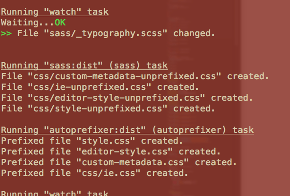
For the 2013 CSR Report, I wanted to level-up our toolset. The other developers on the team had dabbled in Grunt, and thanks to Chris Coyier’s article “Grunt for People Who Think Things Like Grunt are Weird and Hard,” I dove in head first and set up a Grunt configuration with Sass and Autoprefixer. I have to say, Autoprefixer is a game-changer; that along with a mixin to handle rems with a px fallback enabled us to do away with Compass for this project. We moved the CSR Report website to WordPress.com VIP late last year, so we didn’t have to worry about concatenation or minification for this project (WordPress.com does all of that automagically).
Most code for our projects is now stored in private GitHub repos. We’ve been using GitHub more with each new project, and for the 2013 CSR Report we took advantage of the issue tracker to make it easier to focus on specific features to add or bugs to fix. GitHub for Mac made it dead-simple to commit code changes and link those commits to specific issues.
WordPress.com VIP uses Subversion, which none of us were familiar with. For the initial code submission–which includes a thorough code review by the VIP team–we simply zipped up the WordPress theme and sent it to their theme review team. Once we implemented feedback from the code review and established that we were responsible with our code changes, we were granted direct SVN commit access. We’re still new to SVN, and we only had two or three minor code changes after that, so we never integrated our Git repo with SVN. That’s going to be a maintenance issue in the future, but for now we can live with moving our code changes from the Git repo to the SVN repo manually.
Another big change from last year’s report is that we switched code editors from Netbeans to Sublime Text. It was faster and offered a ton of plugins that were simple to install via Package Control. I do miss some of the auto-completion and debugging capabilities of Netbeans, but the speed, simplicity, and ease of use of Sublime Text wins it over in our hearts 🙂
Scalable Vector Graphics
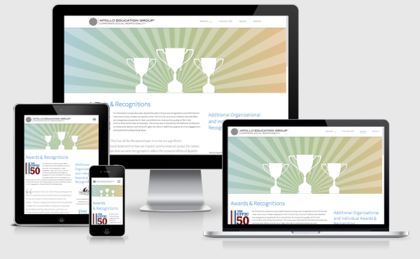
SVG seems to be gaining in popularity (and browser support), and we wanted to take advantage of that somehow. When our designer came up with the large banner graphics used in the report, we knew they were a perfect use-case for SVG. All elements in the banners were created in Adobe Illustrator as shapes, so we knew we could save them as .svg files and incorporate them into the site.
SVG Animation
Initially I researched how SVG works–none of us had used it before–and began testing it in various browsers. Last year’s website had parallax effects, and we wanted to add a little something extra this year too. So I started experimenting with SVG animations. Initially I created animations using SMIL. Once the rest of the team started working on the banner animations we switched to using CSS3 animations because everyone was more familiar with it.
However, once the animations were finalized and we started testing across browsers, we decided to switch back to SMIL due to performance issues and browser inconsistencies. Firefox v24 (our company’s supported version for employees) ignored the CSS transform-origin property on SVG elements, so some scaling and rotation animations were busted. We also noticed that SMIL frame rates were higher than CSS animation in Firefox when rotating the “starburst” elements on the Awards & Recognitions page.
Another issue we noticed were that drop shadows using SVG filters were slow to animate. We modified the SVG files to use <use> elements with opacity and offsets to simulate drop shadows instead.
SVG Cross-browser Compaitiblity
Internet Explorer is not the only browser that doesn’t support SVG well. Some Android versions also lack good SVG support. We used a combination of Modernizr 2.7.1 and a custom test courtesy of SVGeezy (and well-explained on CSS Tricks) to determine if the browser supported SVG as an <img> element. If it didn’t, we swapped in a PNG version of the image via a few lines of JavaScript.
Several other background images on the site use SVG images, and thanks to Modernizr’s SVG test, we simply swapped those images out with PNG versions if the .no-svg class was present.
Internet Explorer
Last year’s CSR Report supported IE6, albeit with reduced functionality and fewer CSS3 bells and whistles. For this year, we decided to support IE8 and higher via a conditional stylesheet. This allowed us to take advantage of box-sizing: border-box without creating hard-coded element sizes for older IE and simplified our IE-specific fixes. We had already been using a Sass mixin that output a px fallback for rems. From there it was a matter of overriding our responsive image styles, adding the styles from the 64em “desktop” media queries so IE8 rendered using the desktop layout, and using CSS adjacent sibling selectors instead of :nth-child selectors for a few elements in order to make IE8 behave.
Final Thoughts
Next year’s report will be primarily a content update rather than a design change, but we may be able to further optimize some of the site’s code based on what we’ve learned since February. Now that the responsive images specification is maturing, there may be other opportunities to optimize content images too.
In the meantime, check out the site and let me know what you think in the comments or on Twitter or Facebook.